Website Redesign: Foxley
A refreshed digital presence for Foxley, a neighbourhood staple on Ossington serving Asian and Pan-Latin flavours since 2007. The original site felt dated and didn’t reflect the restaurant’s energy or character.
Role: Brand Direction, Web Design
Tools: Figma, FigJam
Timeline: One Day
Challenge
The existing website failed to capture what makes Foxley special. It lacked personality, relied on sparse visuals, and didn’t convey the welcoming, lively atmosphere guests experience in person.
Visit the original site here.
Solution
The one-page redesign highlights Foxley’s history, showcases its evolving menu, and positions it as what it truly is: a neighbourhood gathering spot with shareable plates, an ever-changing menu, and always a great time.
Approach
Every decision started with Foxley’s personality, warm, unpretentious, and built for connection. The goal was to create a site that reflects the experience inside, relaxed, communal, and authentic.
Conducted competitive analysis of local restaurants to find inspiration and identify ways for Foxley to differentiate.
Ran branding exercises, including keyword exploration and moodboarding, to define the colour palette, typography, and overall visual direction.
Explored and iterated layouts to balance content and imagery. Then designed a one-page website that feels inviting, image-forward, and true to the brand.
RESEARCH
Competitive Analysis
I researched three popular restaurants in the area to understand what makes them successful hotspots and to inform my design decisions for the Foxley website redesign.
Key Takeaway
Keep it simple: Highlight changing menu, reservations, and the space.
Position Foxley as unique for its long history on Ossington.
Focus on community over trends and the joy of sharing a meal, reflecting its tapas-style dining.
BRAND DIRECTION
History
Since 2007, Foxley has been a neighbourhood staple on Ossington.
One of the early spots that helped shape the strip, it’s known for inventive, shareable dishes. Chef Tom Thai’s menu draws from his Vietnamese roots and sushi background, playing with Asian and Pan-Latin flavours, always guided by what’s fresh and in season.
It’s not just a place to eat. It’s a place to linger, catch up, and leave full.
More A Than B
More slowing down than showing off.
More timeless than trendy.
More neighbourhood ritual than night out for the gram.
More hands reaching in than phones pointing out.
More community than crowd.
Key Words
Authentic
Sincere in experience and service.
Rooted
Grounded in community and neighbourhood culture.
Crossroads
Where paths meet, a natural gathering spot.
Metamorphic
Dynamic and flexible, changing with the seasons and the Chef's whims.
Meet me on Ossington
Foxely isn't just a restaurant; it's a meeting place, having been a fixture on Ossington for 18 years. It's the restaurant you stumble upon near your hostel and can't help but keep going back to. The place for family dinners that turn into late-night drinks with friends. You never know what will be on the menu, but you know enough to trust it will always be good.
This mood board captures that spirit, rooted in community and honest dining.

Mood Board Breakdown
Typography
Copperplate reflects the original window signage and anchors the brand in Foxley’s history. Neue Montreal adds a clean, adaptable voice that mirrors the energy of the rotating menu.
Colour
The palette is drawn from the physical space: inky blue nights, dark wood tables, and a buttery yellow from the iconic Foxley awning.
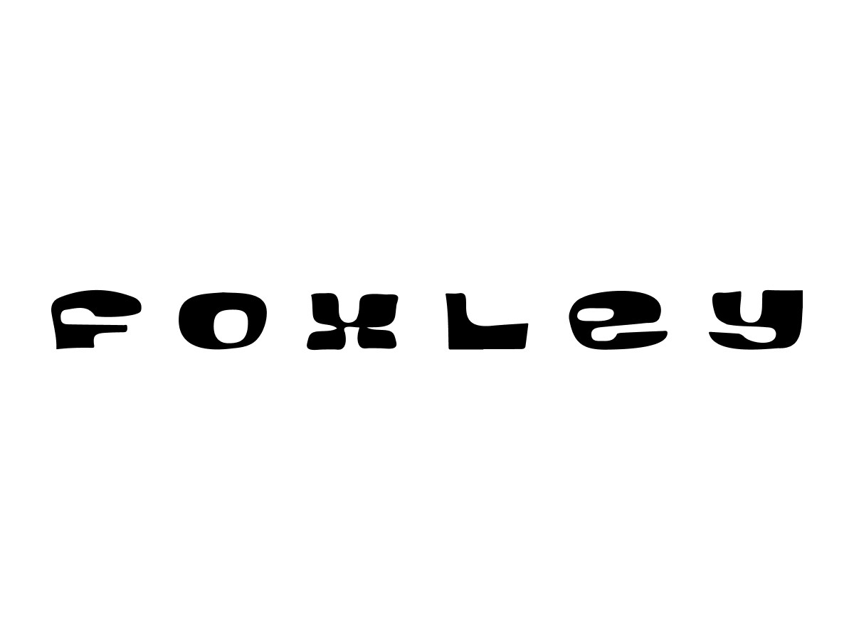
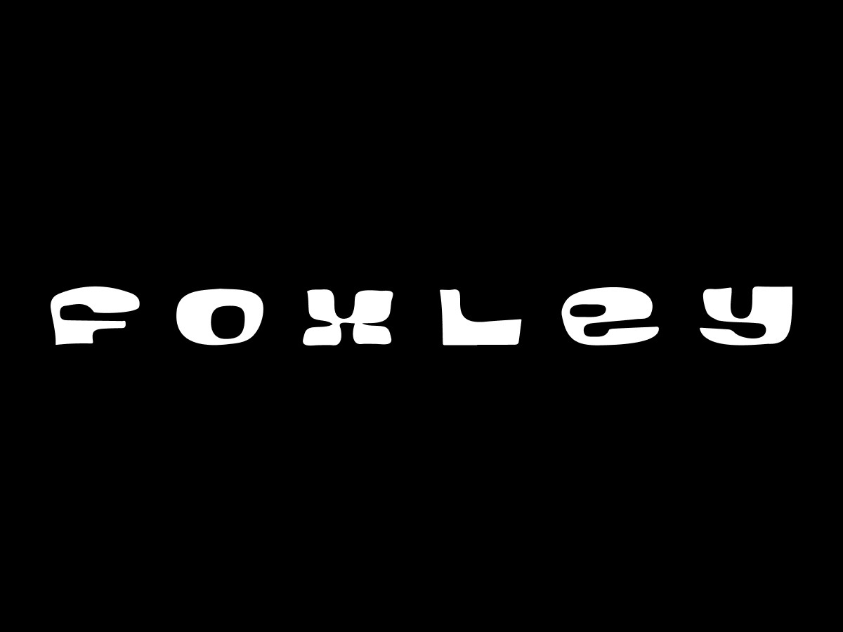
Logo System
Using two wordmarks reflects Foxley’s layered identity. The primary wordmark, Copperplate, comes from the restaurant window and brings structure and history. The secondary wordmark, taken from the awning, is expressive, personal, and iconic.


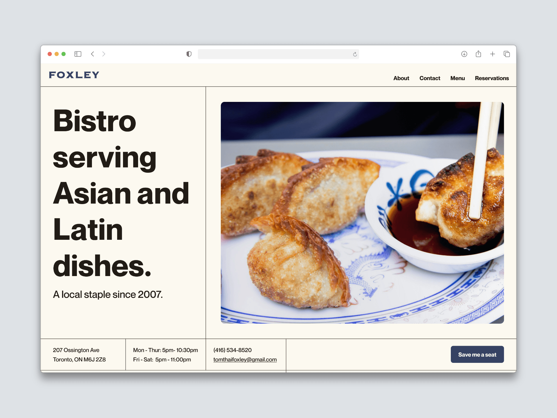
THE WEBSITE

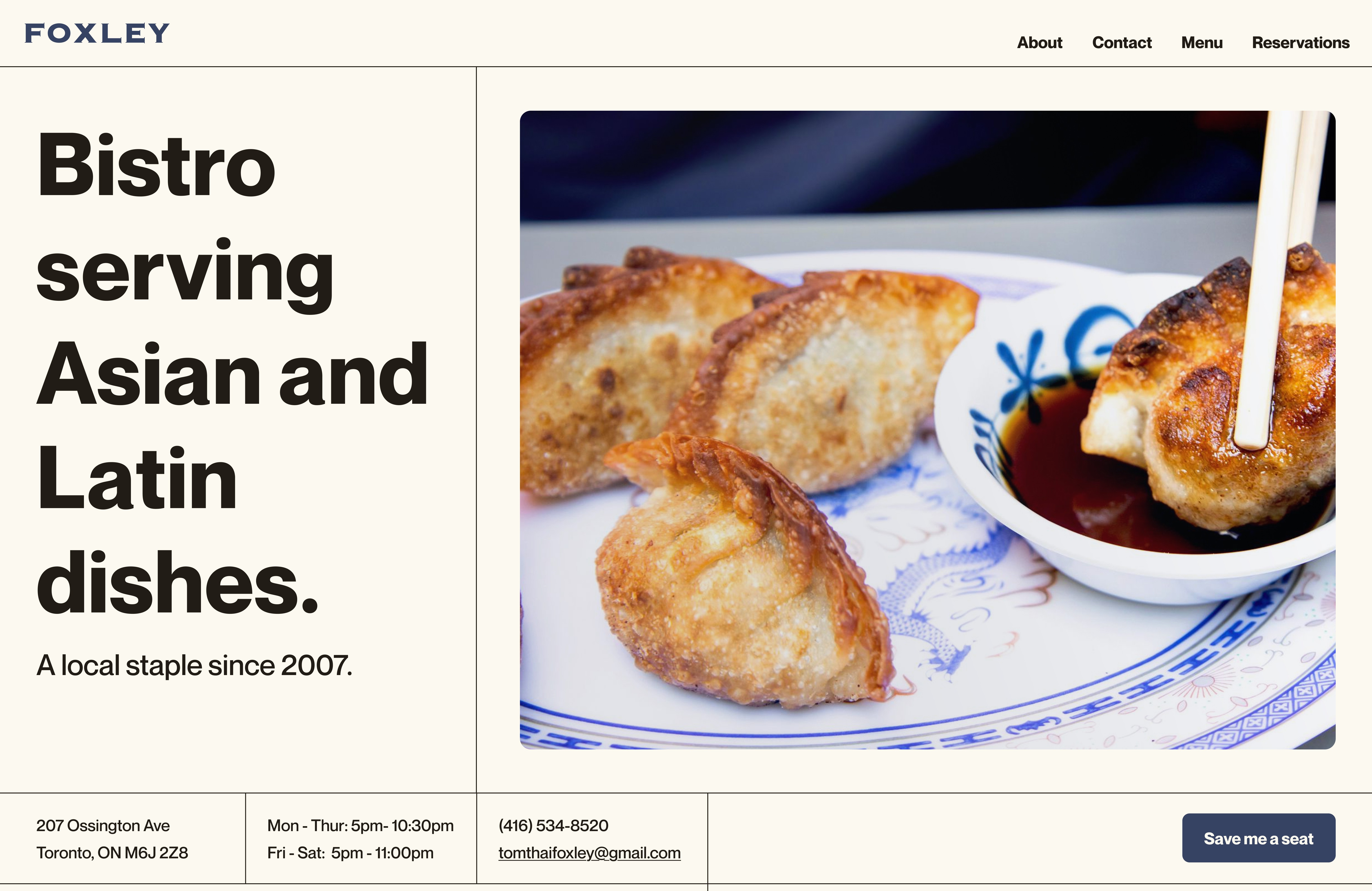
The grid layout reflects Foxley’s crossroads identity, creating framed moments that invite savoring.

An introduction to Chef Tom adds a personal touch and roots the experience in real people.
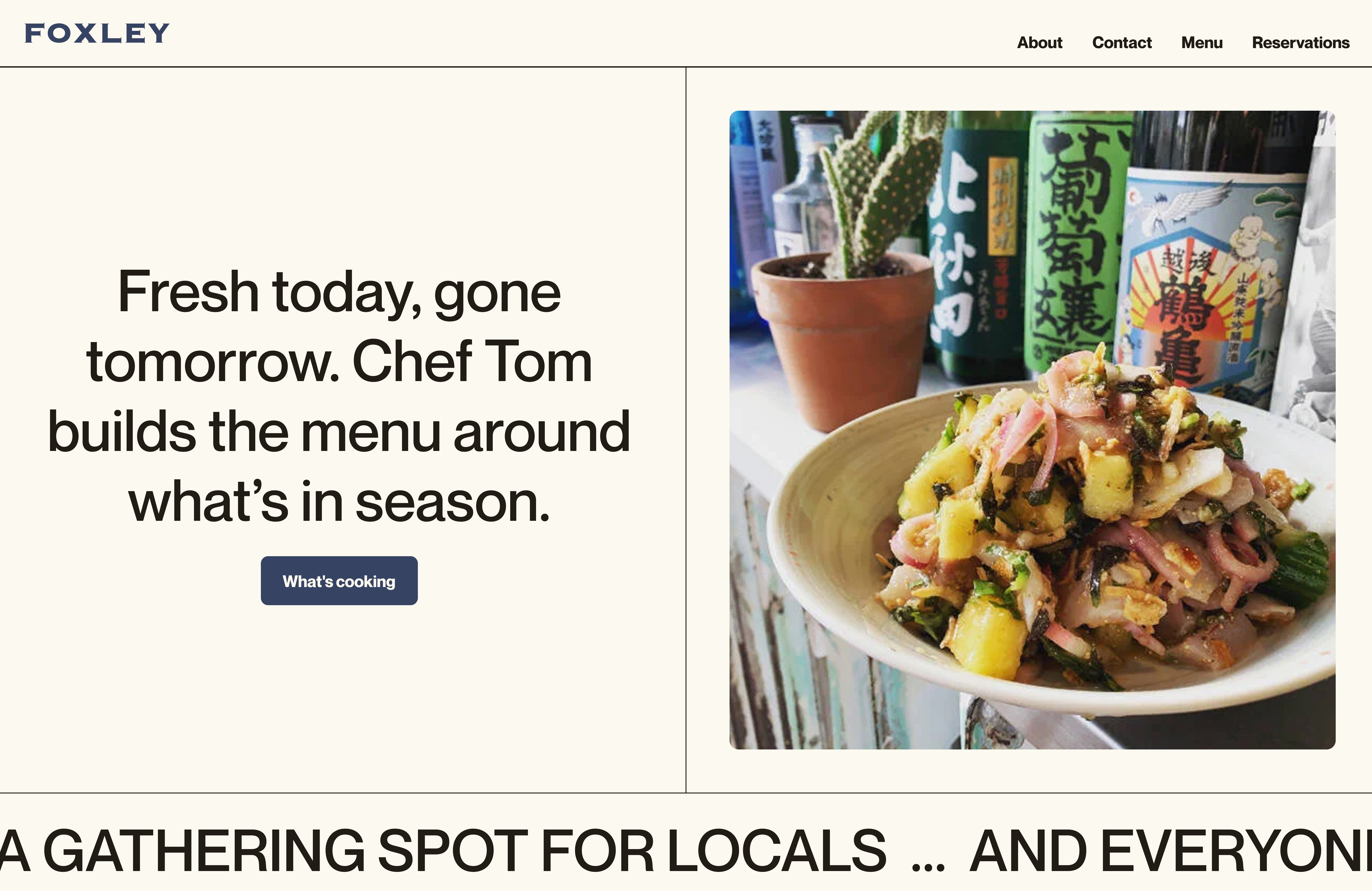
Bold like the food, the oversized type anchors the layout and balances the imagery.
Conversational copy makes the CTA feel casual, like a friend inviting you out.

Softly rounded photo corners add approachability and visual softness. Hover states increase the corner radius, echoing the metamorphic quality of the menu.

Marquee text adds a playful touch to the design and frames key moments. Its movement creates a natural rhythm, like the flow of a conversation.
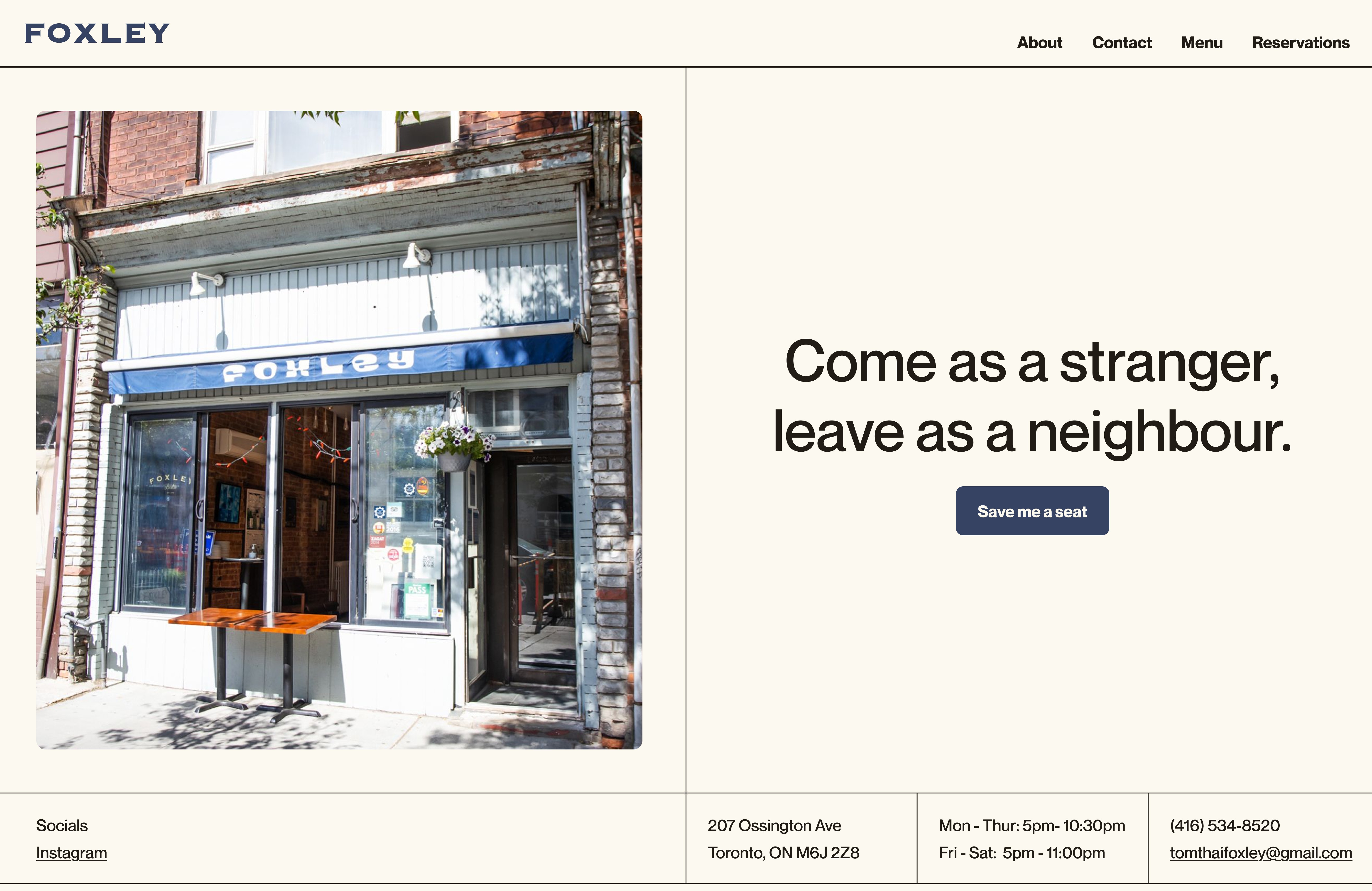
Final Design
Foxley, making people feel at home.
The one-page layout is image-focused and structured to provide quick access to what matters most: menu, reservations, and story.
From sourced photography that captures the cosy dining room and hidden patio, to conversational copy and subtle animations that mirror the easy rhythm of a shared meal, every detail reinforces Foxley’s spirit. Guests leave the site with the same feeling they take from Foxley: welcome, connected, and full.
What I Learned
Biggest Challenge
Insight