A New Way to Listen.
Disc is a mobile iOS app that empowers users to take control of their music discovery through an advanced filtering feature. This prototype addresses the issue of repetitive recommendations by offering users a tool to take control of their listening experience.
Role: UX/UI Design, Research
Tools: Figma, FigJam
Timeline: Two Months

Project Background
This project began with conversations among friends who all shared a common frustration: it felt like everyone was listening to the same thing, and they believed music algorithms were to blame. Fascinated, I decided to dive deeper and explore how others felt about this experience.
Approach
I took a human-centred design approach, conducting both secondary and primary research to understand user needs. Next, I created wireframes and ran two rounds of user testing to refine the experience before moving on to high-fidelity designs.
RESEARCH
Forbes, "New Data Exposes Gaps in the Streaming Music Market and Opportunities for Niche Services." Forbes, 2 Aug. 2019


The Problem
How might we help music listeners with multiple musical identities discover new music and break out of feedback loops caused by music streaming algorithms?
PERSONA

TASKFLOW
WIREFRAMING
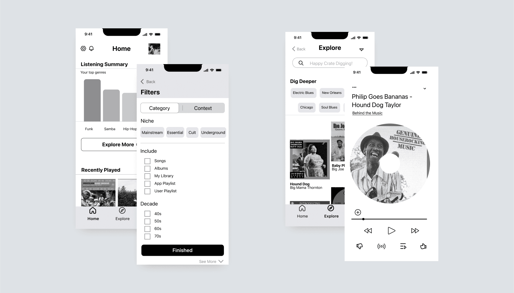
User Testing

Mood Board Breakdown
Music as a lived experience: listening, digging, sharing.
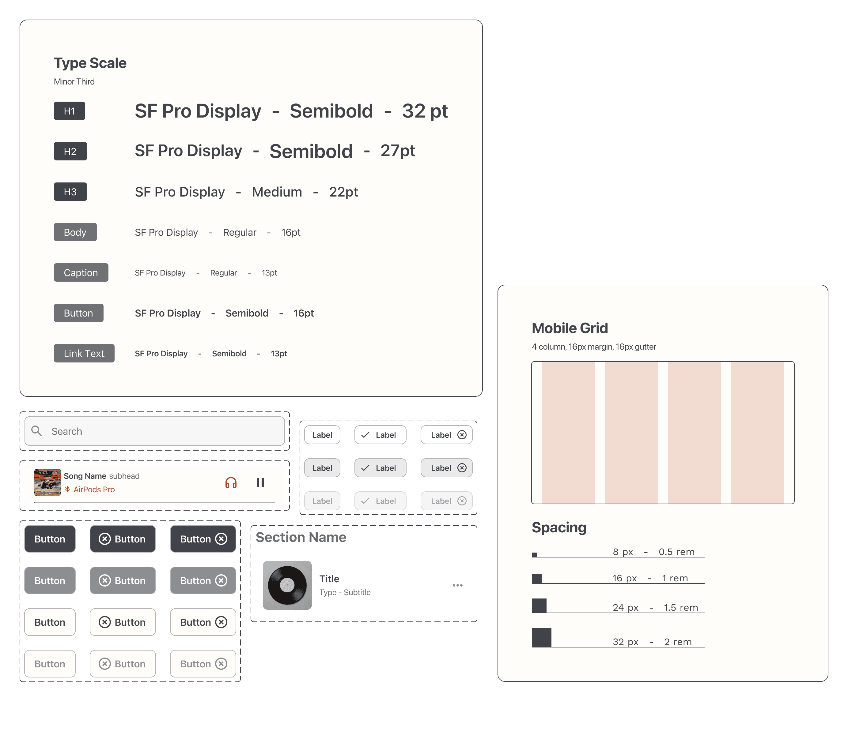
Typography
Futura evokes vintage signage and posters, giving a timeless and nostalgic feel. SF Pro Text is a clean, highly legible font that lets the music be the loudest thing on the screen.
Illustrations
For logo design, the concept embraces soft, rounded shapes that feel friendly, funky, and direct. The jazz collage adds movement and energy, and the black-and-white grain introduces grit and a raw, authentic vibe.
Texture
Sound waves and overlapping spheres suggest the rhythm and fluidity of music, while symbolizing the range and diversity of musical tastes. Graffiti-covered walls are a reminder of underground venues and the thrill of finding new sounds.
Colour
Burnt orange gives energy, while grey-blue acts as a grounding force, providing focus and direction. Creamy white creates openness and freedom, giving users space to feel in control of their own journey.
Logo System
The logo combines a custom icon and an all-caps wordmark, designed to work together or stand on their own. The icon reimagines a Futura D as a record sliding out of its sleeve, a quiet nod to analog discovery. The wordmark, set in bold all-caps Futura, draws from old gig posters and record labels. It’s clean, confident, and not trying to be anything it’s not. Just honest, and exactly what it is.

TOWARDS HIGH FIDELITY
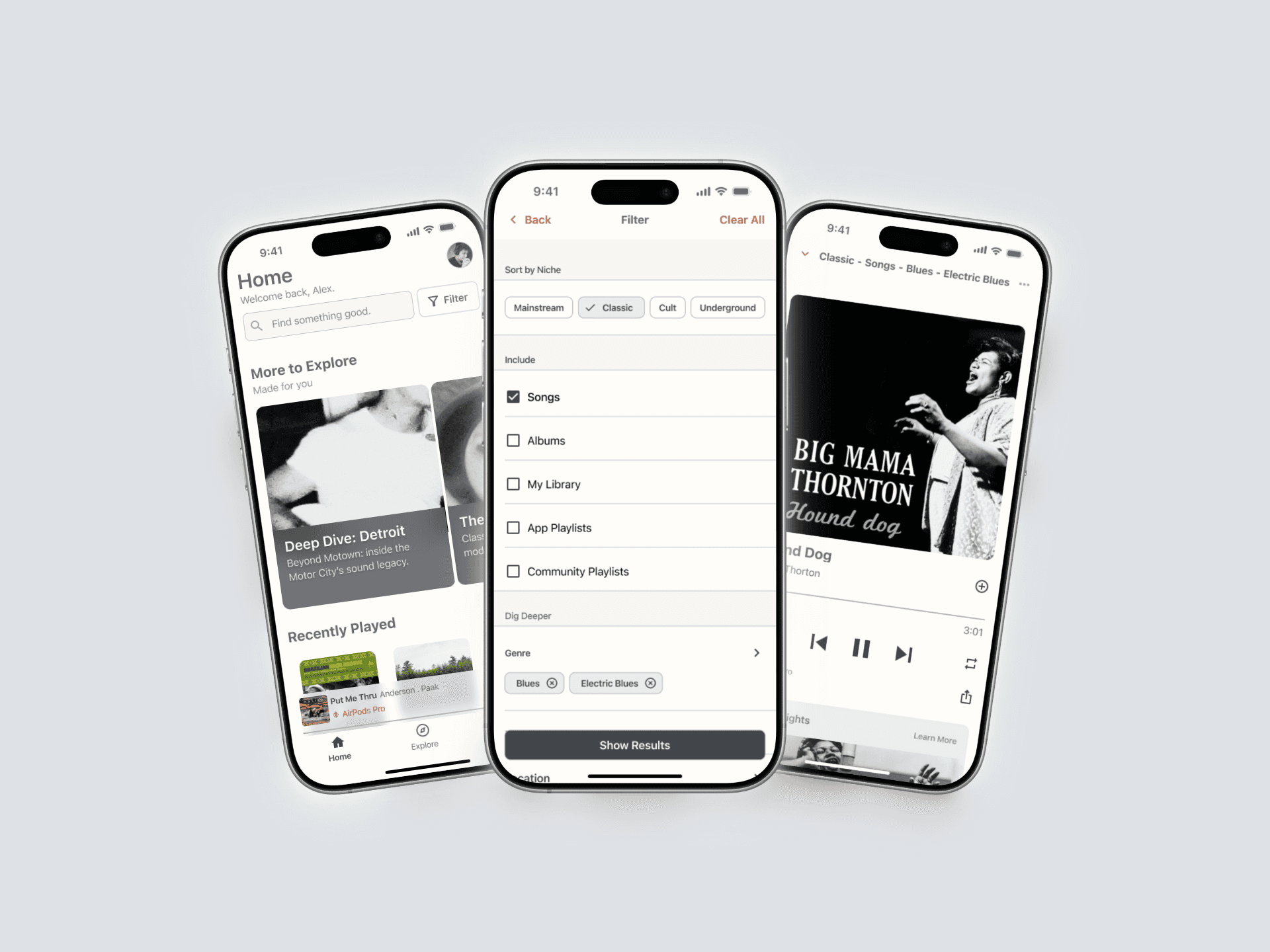
The Outcome
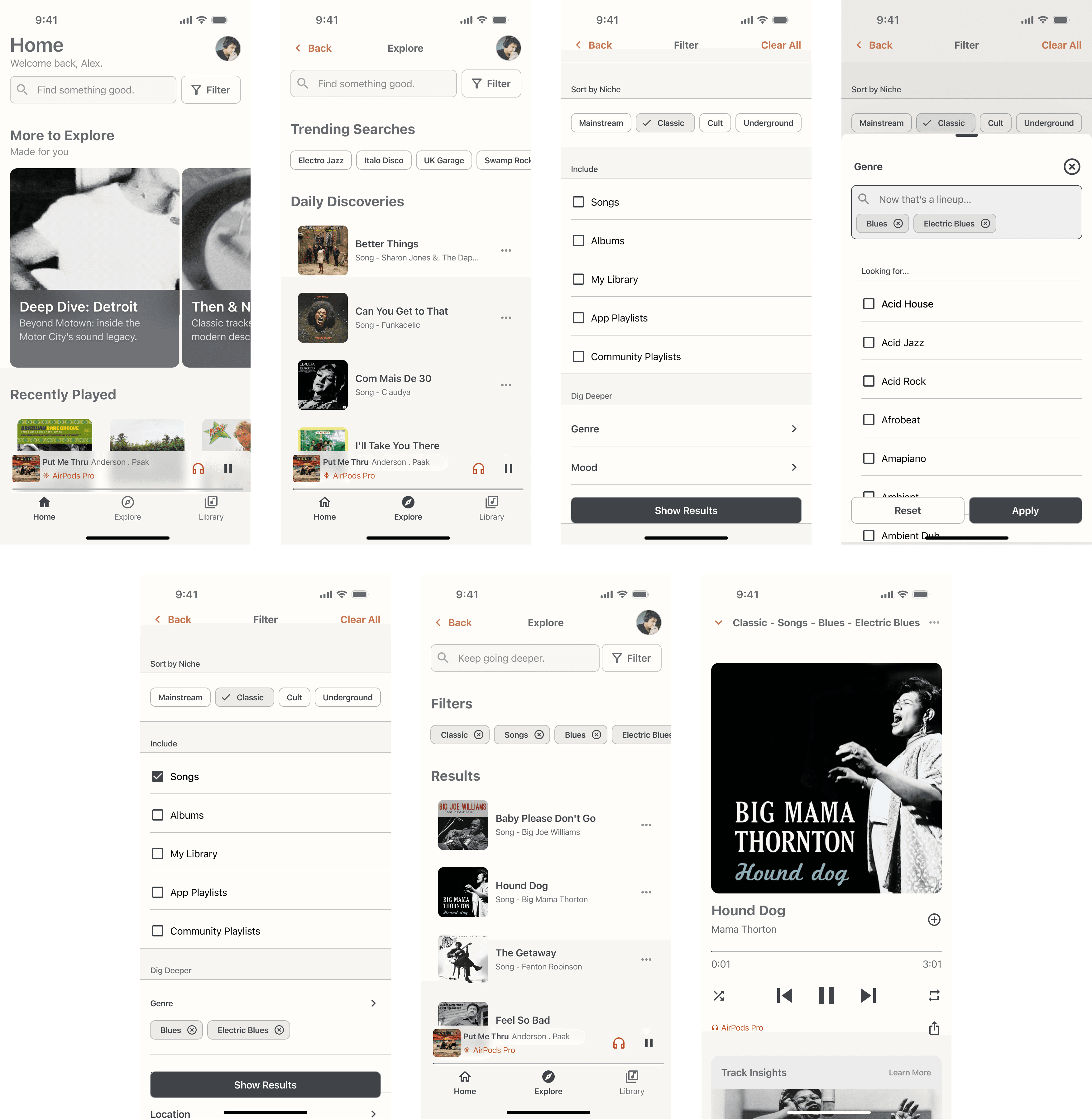
A high-fidelity prototype for a music discovery app that empowers listeners to take charge of how they explore music. The final product provides a tool for music exploration.
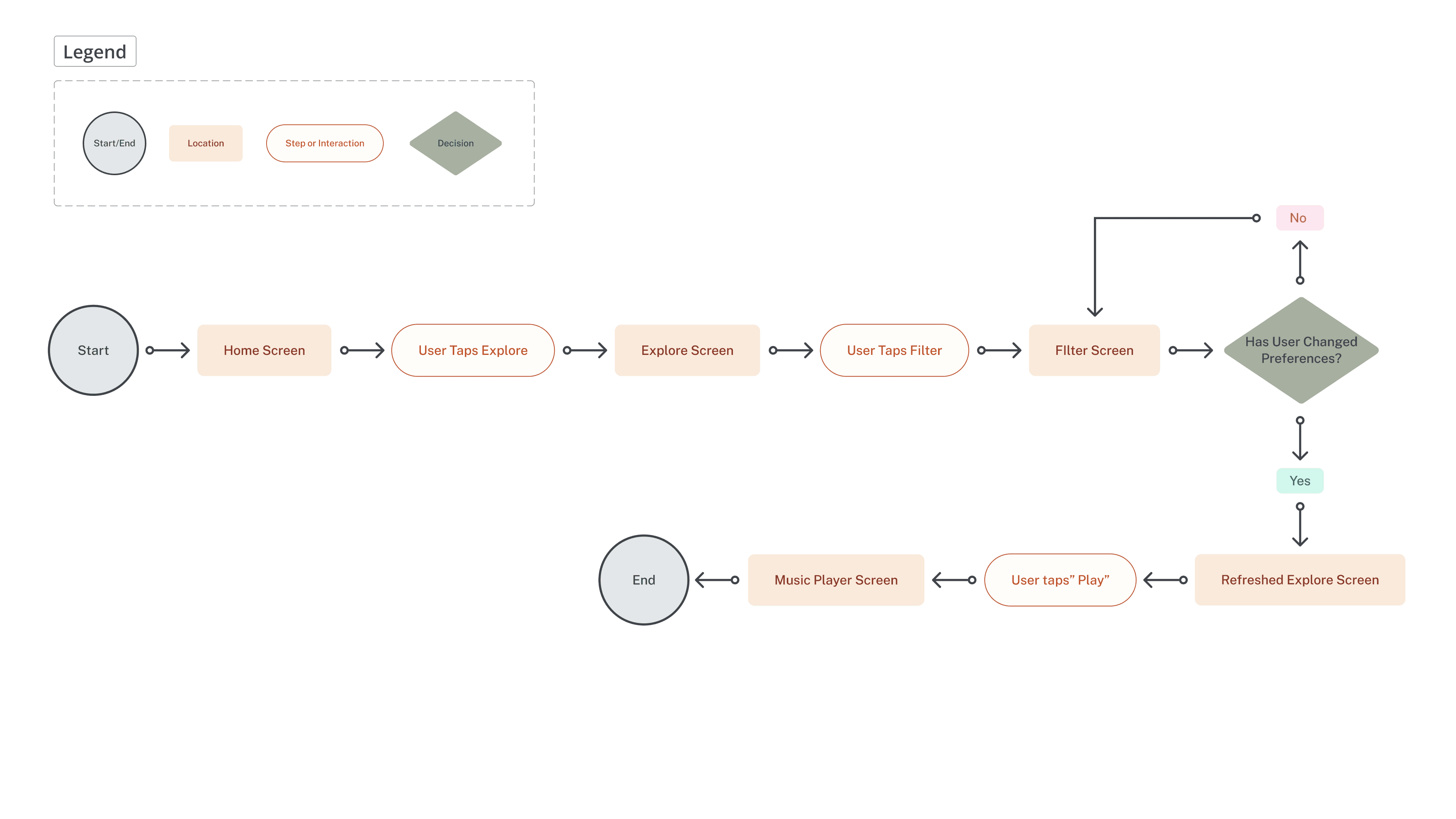
Users navigate from an Explore screen to a Filter screen, where they can filter by niche, genre, location, and more. Ultimately, it’s all in service of allowing the user to search as broadly or as narrowly as they like.
What I Learned
Refocus on What Matters
I learned that it’s okay to pivot. Sometimes, the best thing you can do is step away, reflect, and come back with a clearer perspective.